LONGFU LIFE EXPERIENCE CENTER | LUO STUDIO
Puyang, China
1. Separation of function and space
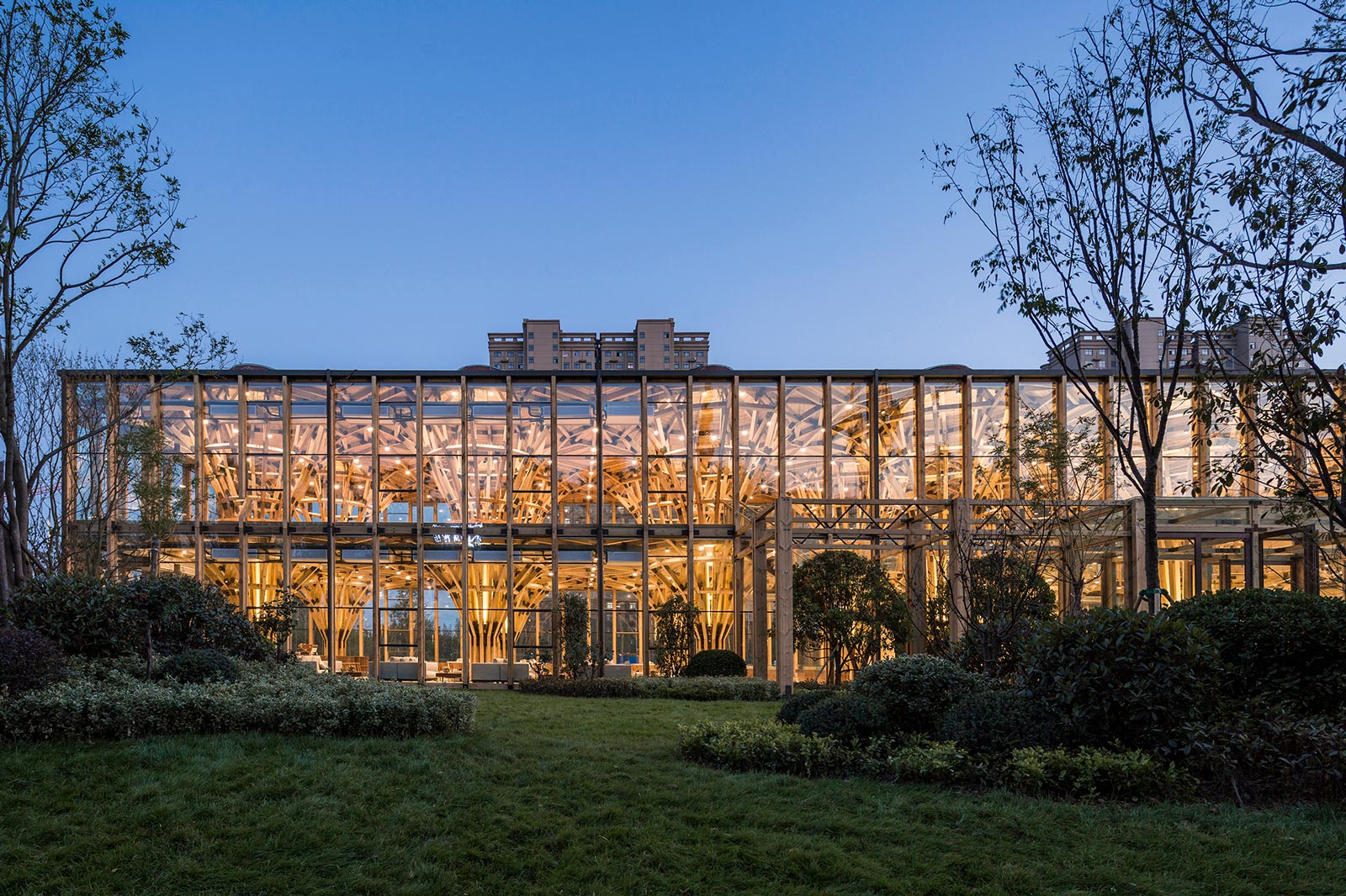
Description provided by LUO Studio. Real estate sales center is a kind of temporary architecture that can only last several months or few years at most, which is usually dismantled after houses are sold out. Even if it can be preserved in few cases, functions are completely transformed. Interior decoration of real estate sales centers is generally complicated, causing obstacles and waste of resources in the process of functional repurposement. The building not only meets the temporary need of marketing but also has the potential for a wide range of other possible usages. It’s more appropriate to say that we designed a space without functional constraints rather than just a sales center. We turned all necessary service spaces featuring great spatial restrictions such as the staircase and bathroom into basic modules in accordance with Ergonomics and meanwhile tried our best to weaken the functional attribute of other remaining spaces. In this way, we separated function and space, so as to eliminate the functional constraints of spaces.
2. Utilization of general timbers to maximize the space and make it extensible
The client is an estanciero who pursues high-quality of real estate development instead of instant commercial profits. Based on the concept of attracting house buyers by creating a better lifestyle, he has been devoted to operating eco-farms as engaging in property development. A green lifestyle was exactly what he wanted to convey to target consumers through the sales center.
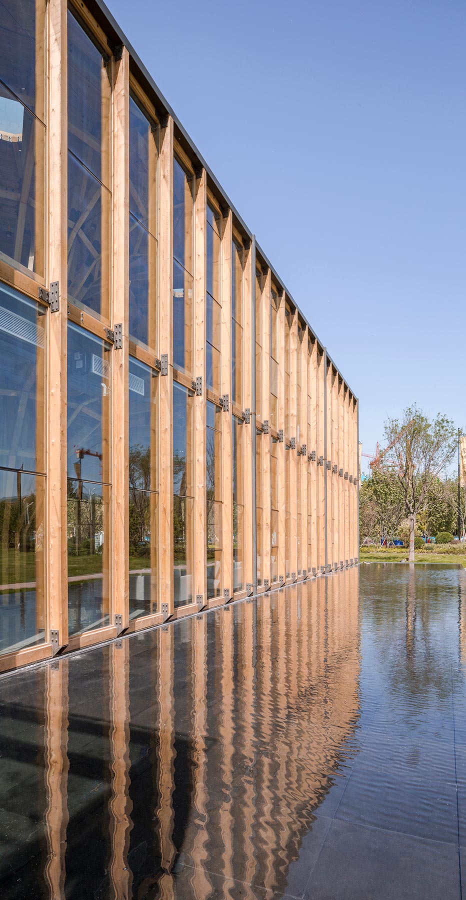
Timbers, the green and natural materials that suite the client’s corporate identity, are undoubtedly the most perfect materials for constructing the building.
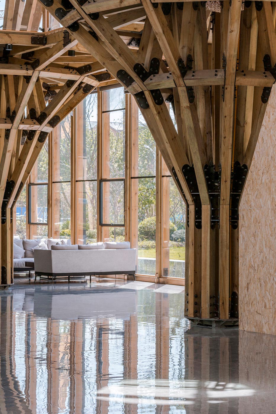
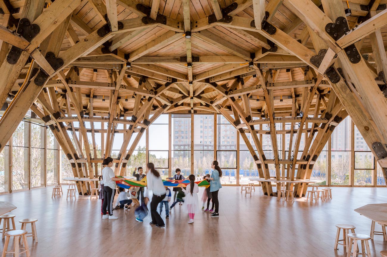
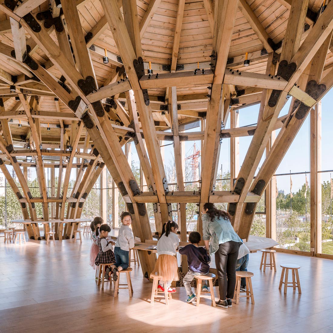
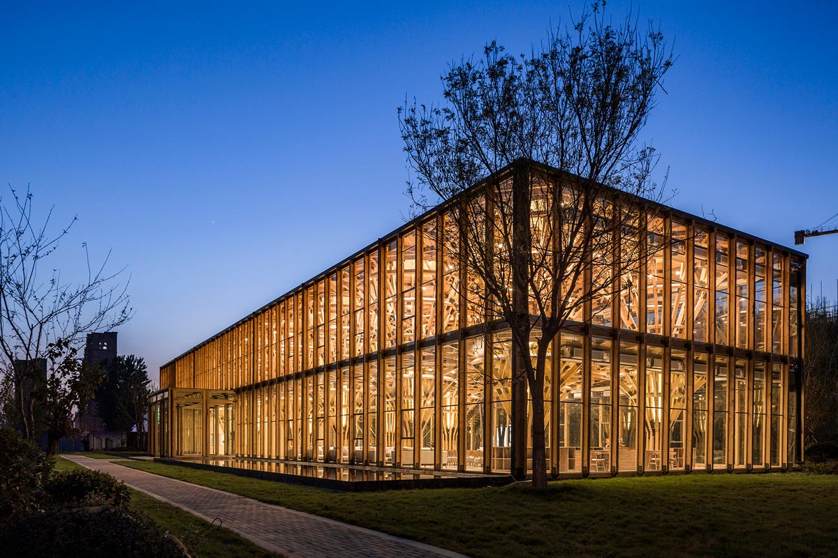
Cost-effective general timber materials that we could purchase were square logs in the length of 3m, 4m or 6m, with a 200mm side length of the cross-section. To build a large solid space and maximize its possible functions, several square timber pillars were combined together to form a “clustered column” instead of using a single wooden pillar as the supporting unit. As forces acting on circle plane are even in different directions, horizontal units of the clustered column were designed in the shape of a regular dodecagon, which is nearly round, with a diameter of 1m. The section size of timber pillars of the clustered column is 120mm*180mm. As for vertical units design, we applied the shape of trees. The clustered column was divided into five segments, each with the length of about 2m. These segments extend outward and upward to the ceiling, forming a cubic edge space with a height of 4.5m and a side length of 8m. With such clustered columns, we not only maximized the lower space but also the structural strength.
The bottom part of each “clustered column” is in the shape of a regular polygon. These “clustered columns” extend upward from the bottom and form a “square” outside edge. Each unit along the edge was horizontally and longitudinally interlined.
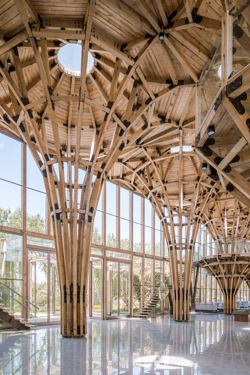
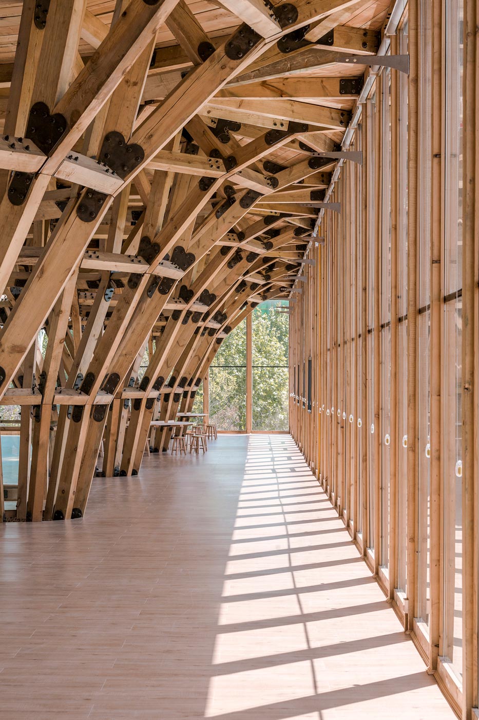
Just like Lego bricks, each unit is independent or combined with others to create the desired space. The space is extensible. With “continuous arch” between each unit, the overall structure is very stable. And the more it stretches, the more stable the structure is.
3.Rapid assembling via basic construction methods & reversibility
We were asked to complete design, construction, finishing, and decoration of the architecture in less than two months and at the same time control the cost. Meanwhile, the architecture was required to be reusable that could be quickly constructed and dismounted. For us, it was a great challenge.
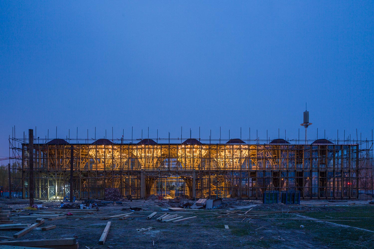
We offered the following solutions. Firstly, trying best to control labor cost and improve efficiency. We adopted simple and basic construction methods as well as common material processing techniques, through which ordinary technical workers were capable of carrying out the construction work and materials could be processed in common factories, which ensured the building to be constructed in a short time. Secondly, ensuring the standardization and modularization of units. We divided the whole building into several primary units. And these primary units were further split into various standard components which were assembled based on a unified approach. The minimum unit could be formed only by three basic components, which was conducive to controlling the size and number of modular units. Besides, we established a set of standard and simple approaches for assembling, so as to accelerate the construction and installation process. Thirdly, subdividing all types of work involved in the project as much as possible, processing materials in different factories, and arranging manufacturing workshops reasonably. In this way, all materials and components could be processed before or while the pre-order work on site was carried out. For example, while measuring and grooving work was carried out at the site, components of the steel structure, wooden columns and steal connection components were processed in different factories separately at the same time. After back-filling was finished, wooden column units were assembled on the basis of the steel structure.
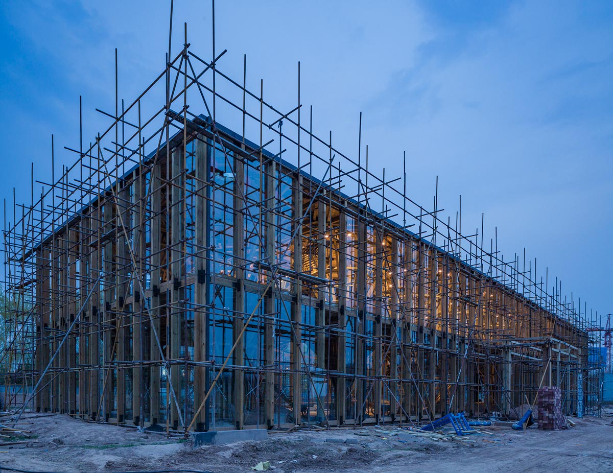
All wooden column units were interlinked through bolting steel connection components. And all relevant work such as the installation of indoor furniture, air conditioning, and wiring systems was carried out in a coordinated way. Eventually, we completed the construction and decoration of the building ahead of schedule.
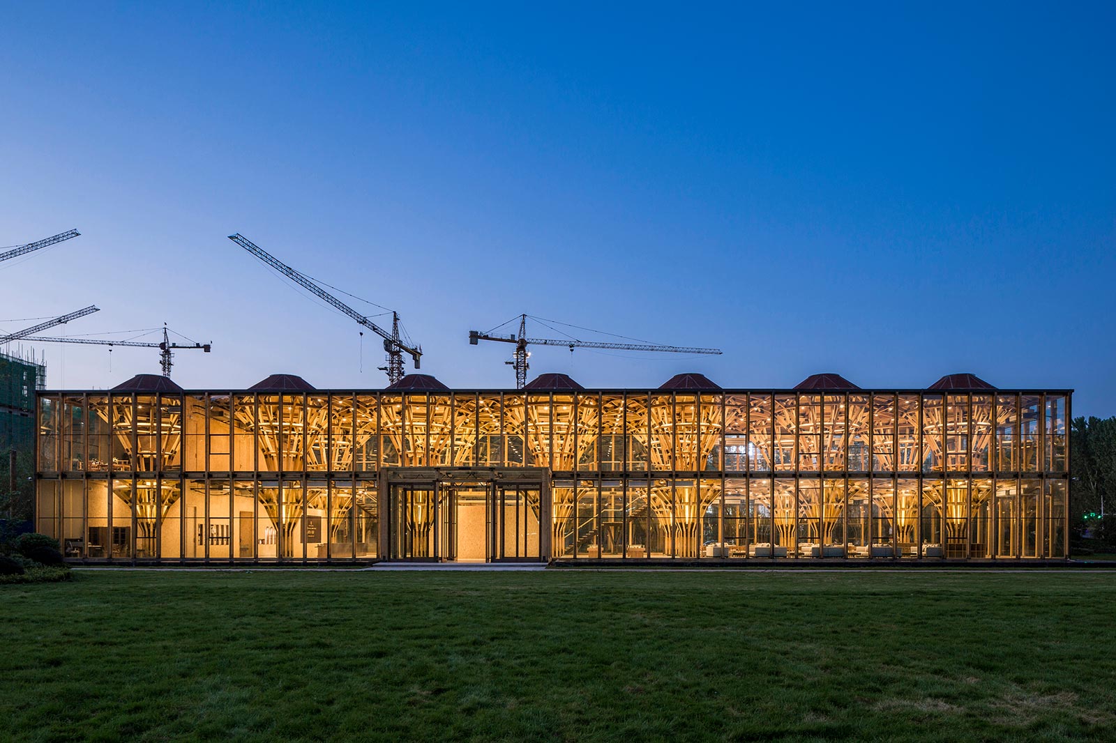
Considering various practical factors, we laid tiles on the ground floor by using cement mortar. However, all other parts in the space were connected by bolts. All components can be completely dismounted, installed, moved and reused for other constructions, making the building thoroughly reversible.
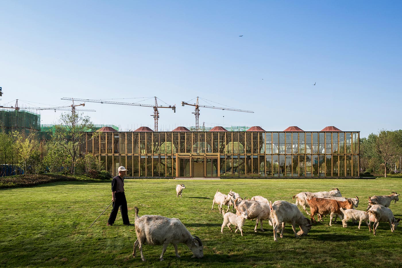
4. Construction of a “smart” cavity
If the building is a person, all the equipment, electromechanics, pipelines of it are the respiratory systems, collaterals and blood vessels of the body. All these systems in the body are by no means isolated but are highly integrated with the skeleton and muscles in a symbiotic state, resulting in a more effective and intensive space.
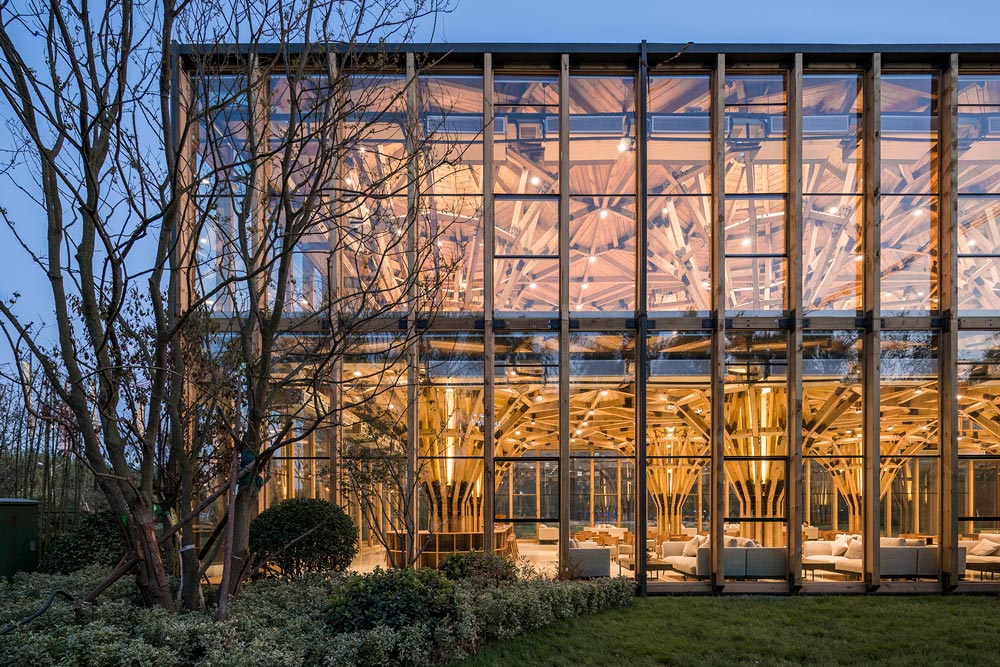
Other parts of the building were also designed in a way similar to the structure of the body. Taking furniture as an example, all the furniture “grows” on the structural column, with each table surrounding a single “clustered column”. All the furniture and guardrails stretch out of the core structure and even weave a surface by extending outward. These necessary parts are concomitants of the main structure, providing support against it and making it more stable.
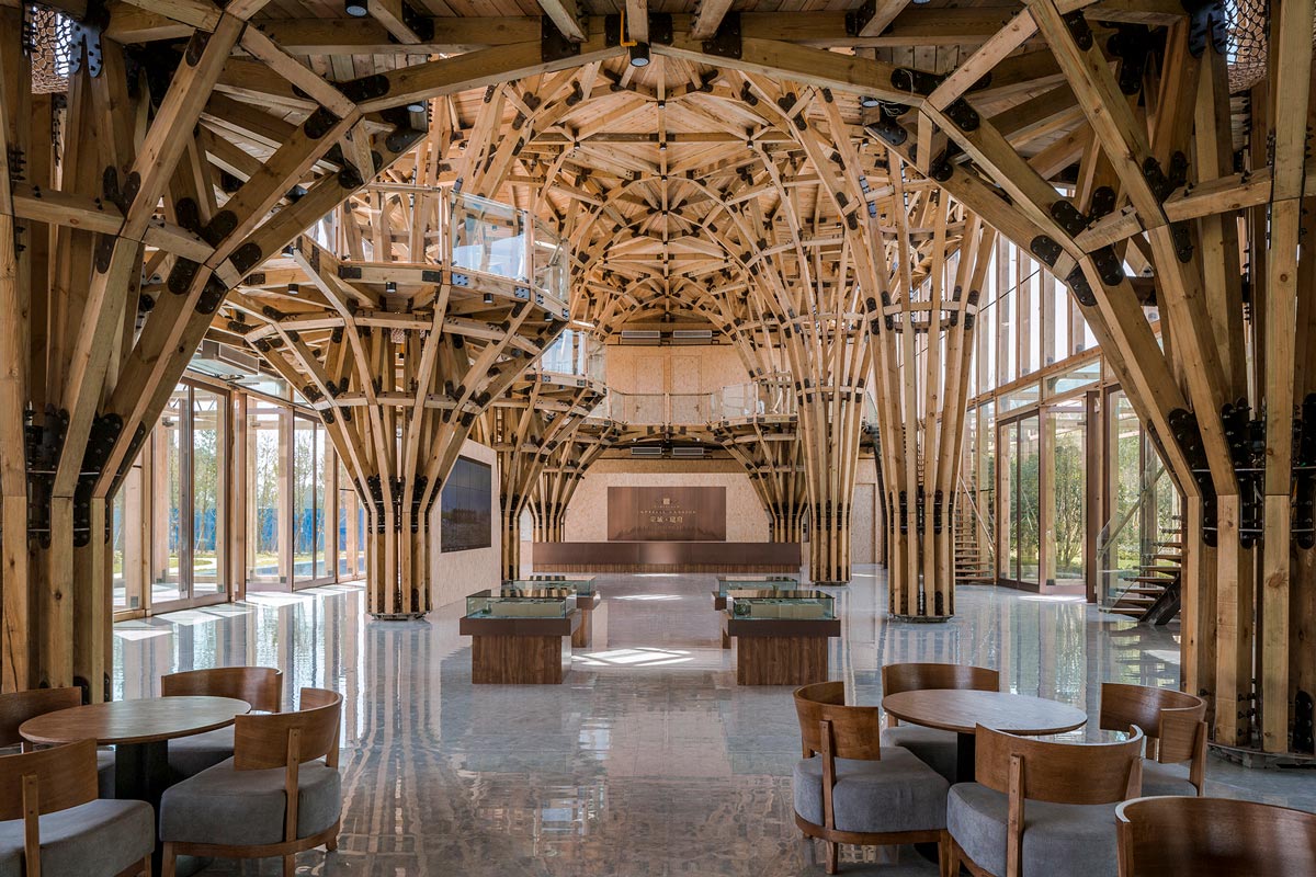
Equipment, electromechanics, pipelines, furniture, and exterior were integrated into units of the structure to achieve the smallest occupancy, which facilitated separation of function and space and created a “smart” space resembling cavity of the human body.
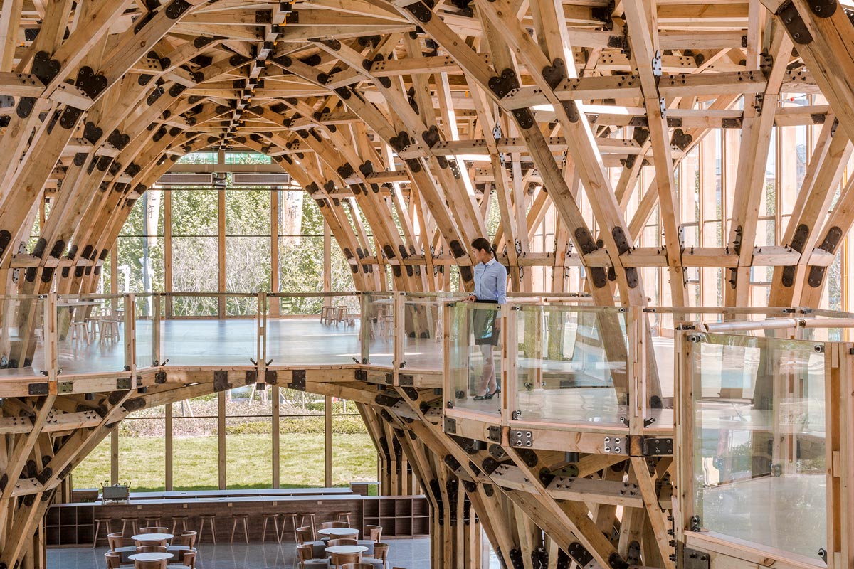
5. Universal space & universally-used space
Mies van der Rohe called the Crown Hall at the Illinois Institute of Technology in Chicago a“universal space”. The design permits the building to change its functions, so Mies declared it “the clearest structure we have done, the best to express our philosophy.”
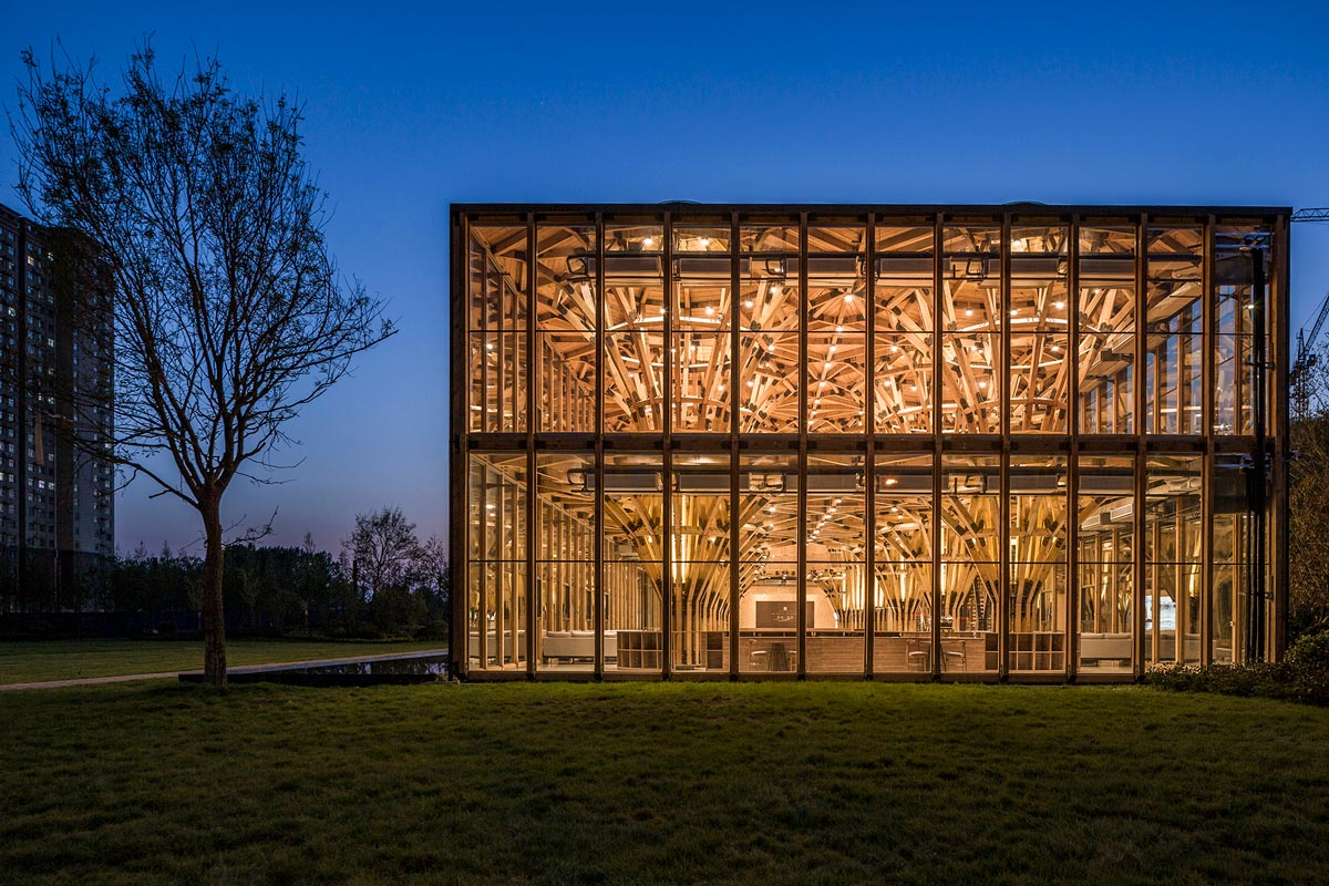
As designing and constructing the Longfu Life Experience Center, we chose to use standard timbers in China and utilized common processing and construction techniques, with a view to creating a “universal space” that boasts infinite possible usages rather than be limited to a certain specific function. The building is a “universal” space, but more importantly, it is a “universally-used space”. The whole building or any part of it can be enlarged, cut, replaced or moved based on different needs. What’s more, it can also be completely dismounted and repurposed, and its materials can be reused for other constructions, hence achieving the objective that both space and materials can be most universally used
Project Information
Project name: Longfu Life Experience Center—A Universally-used Space Created by General Timbers and Techniques
Design Team
Design studio: LUO studio (http://www.luostudio.cn/)
Chief designer: Luo Yujie
Participating designers: Wang Xiaotao, Wei Wenjing
Client (Design consultant): Lai Lijun
Construction company: Puyang JINGYI Architectural Decoration, Design and Engineering Co., Ltd.
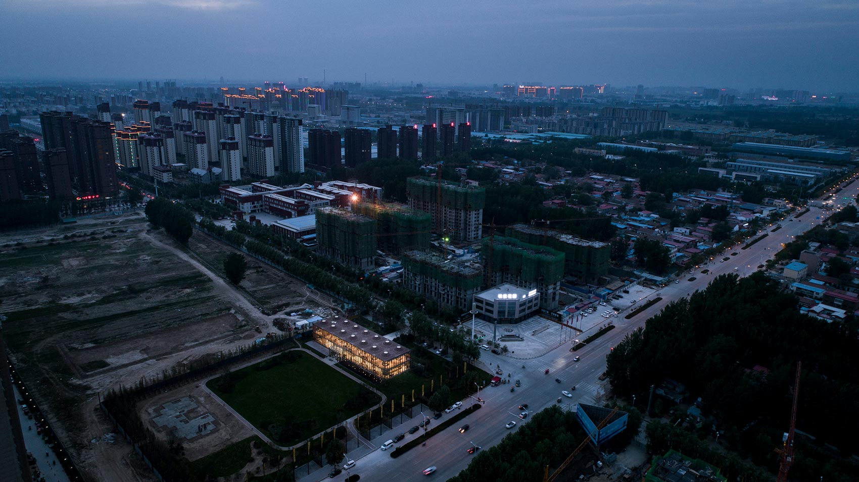
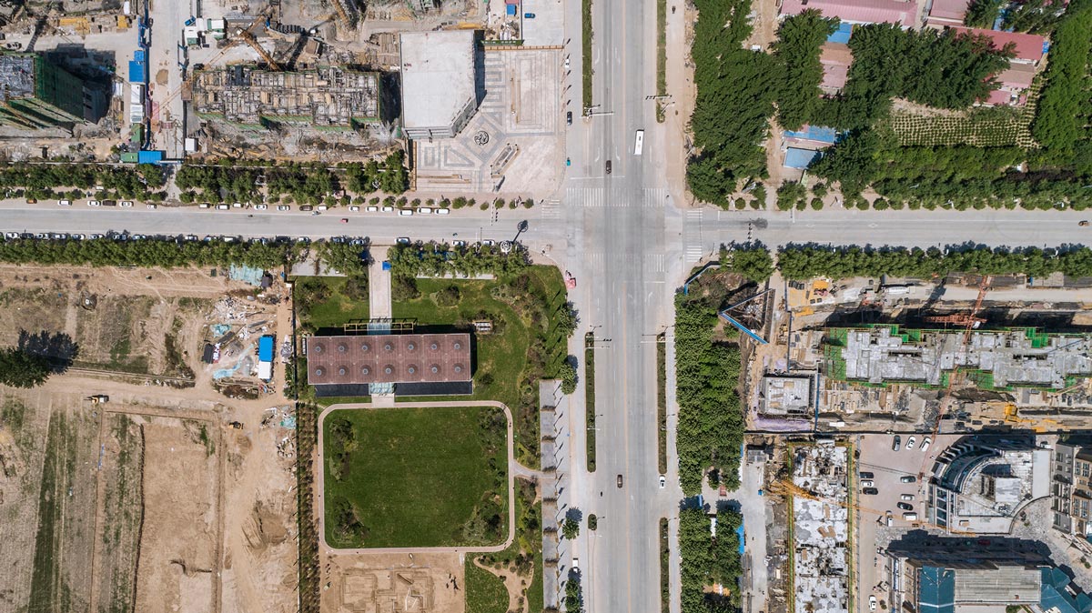
Project Location: Southwest of the intersection of Changqing Road and Fumin Road, Puyang County, Henan Province, China
Construction area: 1,588 m2
Photographer: Jin Weiqi
Design date: January 15, 2018
Completion date: April 10, 2018 (49 workdays in total for material processing and on-site construction)


